Measuring progress on the Sustainable Development Goals (SDGs) is more complicated than it was for the Millennium Development Goals (MDGs). Although a total of 60 indicators were identified for the one or more targets for each of the MDGs, in practice, the measure of success was largely limited to a single target. Thus the promise to reduce extreme poverty by half, which was the primary concern, was celebrated as accomplished when the World Bank target of halving the number of people living on US$ 1.25/day was reached, even when the poverty profile of most developing countries remained much more nuanced. Similarly the goal of reducing gender equality was considered advanced when the target of universal primary education was reached.
The SDGs confront a different problem. Despite pressure from donor countries to try to limit the goals and targets, the Interagency and Expert Group on SDGs (IAEG-SDGs) was asked to identify at least one (frequently more) indicator for each of the 169 targets, which to date has resulted in a list of 231 indicators and might end up with some 300 indicators. The challenge is now how to avoid evaluating progress on each of these separately without considering the way in which each impacts on others.
In this regard it is useful to recall the observation by Commission on the Measurement of Economic Performance and Social Progress (the “Stiglitz-Sen-Fitoussi-Commission”), which stated:
“The assessment of sustainability is complementary to the question of current well-being or economic performance, and must be examined separately. This may sound trivial and yet it deserves emphasis, because some existing approaches fail to adopt this principle, leading to potentially confusing messages. For instance, confusion may arise when one tries to combine current well-being and sustainability into a single indicator. To take an analogy, when driving a car, a meter that added up in one single number the current speed of the vehicle and the remaining level of gasoline would not be of any help to the driver. Both pieces of information are critical and need to be displayed in distinct, clearly visible areas of the dashboard.”[fn]Commission on the Measurement of Economic Performance and Social Progress (2009), p. 17. [/fn]
The recommendation to not attempt to capture in a single number the assessment of the sustainable development agenda is not easy to follow. Looking at the 17 goals with their 169 targets and two or three proposed indicators for each one, the temptation emerges to average the indicators for each goal, then average the resulting numbers and voilá, there you have it, all countries of the world instantly photographed and ranked according to their performance.
This is, in essence, precisely the path followed by the Sustainable Development Solutions Network (SDSN), led by economist Jeffrey Sachs, in computing its “Preliminary Global SDG Index” that ranks 147 countries.[fn]Cf. Sachs et al. (2016). The authors have submitted the draft to public consultation through to 31 March 2016, but do not allow citation. A “revised and expanded version for public use” has been announced. [/fn] The first five are Nordic countries, followed by three German-speaking countries. Nine of the last ten are least developed countries (LDCs) and all but three of the bottom twenty are in Africa. This index has a high degree of correlation with the UNDP’s Human Development Index (HDI).
The SDSN index includes indicators related to each of the 17 goals, but its ranking shows striking similarity to the more focused Environmental Performance Index (EPI), launched in May 2016 by the Yale Center for Environmental Law and Policy, in collaboration with the World Economic Forum (Davos) and others.[fn]Cf. Hsu et al. (2016). [/fn]
The EPI claims to have a “parallel approach” to the internationally agreed SDGs in its “use of quantitative metrics to evaluate policy performance” and maintains that “(a)ligning EPI’s indicators with the SDGs provides a baseline for evaluating national performance and shows how far countries are from reaching global targets.”[fn]Ibid. p. 11. [/fn] Of the EPI’s 180 countries, the best performers are Finland, Iceland, Sweden and Denmark, while Singapore is the only developing country among the best 30. Germany is number 30, outranked by France at number 10 and the USA at number 26. At the other end, “the Index’s bottom third, comprised mostly of African countries, is a list of troubled states whose problems extend beyond their inability to sustain environmental and human health.”[fn]Cf. www.socialconnectedness.org/wp-content/uploads/2016/01/Yale-EPI-FACT-SHEET_2016.pdf. [/fn] This assessment leads the authors to conclude that “environmental performance is an issue of governance - only well-functioning governments are able to manage the environment for the benefit of all.”[fn]Cf. Hsu et al. (2016), p. 11. [/fn]
This conclusion is surprising, since the EPI does not explicitly include any governance indicators, unlike the SDGs, which include several such indicators in Goal 16. What EPI evaluates is organized around nine major issues (health, air quality, water and sanitation, water resources, agriculture, forests, fisheries, biodiversity and habitat, climate and energy). In each of these areas country scores (from 0 to 100) are determined by how close or far countries are to targets, which the authors select from international agreements, scientific thresholds and their own analysis of “best performers.”
Thus, in the case of climate, for example, since “there are no globally agreed-upon targets for CO2 reduction”[fn]http://epi.yale.edu/chapter/climate-and-energy [/fn] the EPI measures improvements in carbon intensity. As a result, over-polluters (Britain, Denmark, USA) appear as “over-achievers” while those that emit very little year after year are downgraded. Historic trends count to measure progress but not in terms of accumulated responsibilities. Similarly, the section on biodiversity and habitat measures not the actual loss of biodiversity, but instead the expansion of protected areas.
In the case of water, the EPI target is to achieve 100 percent of wastewater treatment, which will obviously put developed countries on top. This kind of approach, which measures the capacity to address a problem and not the scale of the problem in each country or the historical responsibility for creating it, explains the correlation between the EPI and the SDSN index with per capita income. Wouldn’t it be logical, as well as fair, to give some credits to those that produce less waste to start with? Would Bangladesh be at the bottom of the table (173rd in the EPI) if climate damage created by others was accounted for?
Ranking all countries irrespective of their capacities and responsibilities and measuring efforts to clean up the mess while not awarding credits to those that do not produce waste is not a helpful way to summarize global sustainability. Both the EPI and the SDSN Index convey the message that the OECD countries are good environmental performers while African countries are damaging the planet. If the best rankings correlate with wealth, more economic growth appears as the solution to the problems of humanity.
A dashboard that more closely captures the basic notions of sustainable development that underpin the 2030 Agenda would offer a very different picture. Many key elements for such a dashboard already exist. They do not provide a way to proclaim winners and losers, as the 2030 Agenda is not a competition. It defines itself, instead as a “collective journey” and a commitment “to take the bold and transformative steps which are urgently needed to shift the world on to a sustainable and resilient path.”[fn]United Nations (2015), preamble. [/fn]
Eight numbers for the 2030 Agenda
While undoubtedly more work needs to be done to gather and process indicators for the new Agenda, existing databases, indexes and indicators already provide the basic components of a Global Dashboard against which to measure progress or regression. Our proposed preliminary dashboard of what is already available includes:
- Basic Capabilities Index
- Gender Equity Index
- Social Protection Floor Index
- Climate Equity Index
- Palma ratio
- Global Militarization Index and homicides rate
- Financial Secrecy Index
- Social Intensity of carbon
These measures show diverse and independent dimensions of sustainable development. Militarization, gender inequalities and carbon emissions do not necessarily move in the same direction. While it therefore makes no sense to average them in a single number, each of the eight tells a story and, when looked at multiply and in terms of their complex interactions they can start to form a dashboard picture to help steer the 2030 Agenda.
1. The Basic Capabilities Index: A measure of deprivation
Social Watch developed the Basic Capabilities Index (BCI) as a tool to monitor social deprivation, combining such indicators as mortality among children under age five, the proportion of births attended by skilled health personnel, and three education indicators (adult literacy rate, primary net enrollment rate, survival rate to fifth grade). The results roughly correlate with the UNDP Human Development Index that ranks countries by a combination of life expectancy, education, and income per capita indicators.
The major difference between HDI and BCI is that the latter does not include income data, in order to highlight the fact that without adequate social policies, economic growth by itself does not guarantee progress in social well-being. Per capita income can grow indefinitely, while school matriculation cannot be more than 100 percent or infant mortality cannot be lower than zero. Thus, if one plots BCI along one axis and per capita income along the other, the point is reached where BCI no longer grows with income—a point that can be shown empirically to be around US$ 10,000 per capita. Some countries with a per capita income four times higher do not show lower infant mortality rates.
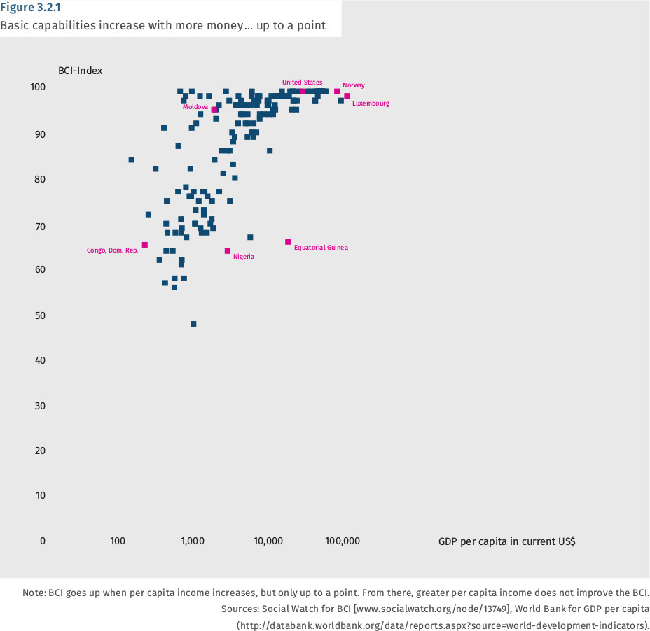
Of course, a BCI close to 100 does not imply total social well-being, but rather that the countries reaching it have met minimum essential requirements.
The BCI originated in the Quality of Life Index developed by Social Watch Philippines to assess social deprivation at the municipal level by using education and health figures that civil society could access (and verify) locally. At the global level its advantage is its simplicity, transparency and use of UN-endorsed figures, which strengthens civil society advocacy based on its findings.
A Multidimensional Poverty Index[fn]Cf. www.ophi.org.uk/multidimensional-poverty-index/global-mpi-2016/. [/fn] was first calculated in 2010 by the Oxford Poverty and Human Development Initiative (OPHI) and is now published by the UNDP Human Development Report. This index elaborates on the idea of measuring poverty not by income but by dimensions such as health, education, living standards and quality of work. The MPI is available for 100 countries and does not include OECD members, except Mexico. This exclusive focus on developing countries reduces its usefulness for global comparisons in terms of sustainable development.
The OECD has developed its own “better life index,”[fn]Cf. www.oecdbetterlifeindex.org/. [/fn] which combines statistics for its members on eleven topics (e.g., education, health, housing, but also citizen involvement and quality of the environment) and allows users to rate each topic according to their subjective importance to the user and thus come out with different rankings.
These efforts are consistent with the observation of the Stiglitz-Sen-Fitoussi Commission that “no single measure can summarize something as complex as the well-being of the members of society” and therefore “the issue of aggregation across dimensions (i.e., how one adds up, e.g., a measure of health with a measure of consumption), while important, is subordinate to the establishment of a broad statistical system that captures as many of the relevant dimensions as possible. Such a system should not just measure average levels of well-being within a given community, and how they change over time, but also document the diversity of peoples’ experiences and the linkages across various dimensions of people’s life.”[fn]Cf. Commission on the Measurement of Economic Performance and Social Progress (2009), p. 12. [/fn]
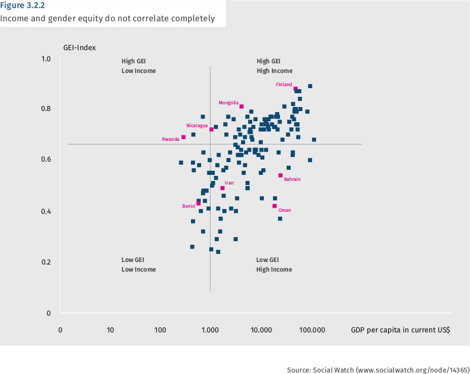
2. GEI: Measuring the gender gap
The gender divide is one of many other divides (e.g., ethnicity, wealth, race, religion, caste) that underline the “diversity of experiences” within any community. Social Watch developed a Gender Equity Index (GEI)[fn]Cf. www.socialwatch.org/taxonomy/term/527. [/fn] to measure the gap between men and women in education, the economy and political empowerment. The GEI differs from other gender indexes in that it focuses on the gaps and not on the absolute well-being of women. While women's health and education may correllate with the per capita income of their countries, the gap between the health and education of women and that of men does not. The graph below clearly shows that some countries have low income levels but better gender equity others with much higher income levels.
Further, while many countries score close to the maximum in education, no country in the world has achieved gender equality in the economic and political empowerment areas.
3. SPFI: Social protection floor does not need to be expensive
Using a methodology also based on identifying and quantifying gaps, the Maastricht Economic and Social Research Institute on Innovation and Technology of the United Nations University (UNU-MERIT) has now produced a Social Protection Floor Index (SPFI).[fn]Cf. Bierbaum et al. (2016). [/fn]
The SPFI assesses the degree of implementation of national social protection floors by identifying gaps in the health and income dimensions and indicating the magnitude of financial resources needed to close these gaps in relation to a country’s economic capacity.
The income gap depends on what poverty line is used as a reference, and therefore the SPFI is calculated for the two so-called “absolute” lines of US$ 1.90 a day and US$ 3.10 a day defined by the World Bank and for the relative minimum income level (incomes below 50% of the mean).
On this basis, the SPFI shows that “most countries do not have to invest unreasonably large amounts to close their social protection gaps.” In countries where the shortfall is relatively large in comparison to countries with similar economic capacity and development, this is not due to economic or fiscal non-affordability but “to political will and prioritization in national spending decisions.” At the bottom of the ratings there are a few countries where the required resources would be larger than 10 percent of GDP. In such cases the support of the international community is indispensable in order to enable them to implement sound social protection floors. For more detail, see Table 3.2.6 at the end of this chapter.
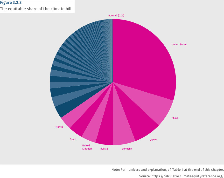
4. Climate Equity Index: Responsibility and capability
The main difficulty in reaching a climate agreement that actually reduces emissions is not the quantification of the total “budget” needed to enable countries to mitigate their impacts (before the atmospheric carbon reaches a catastrophic level), but how to distribute fairly the costs of adapting to that budget, mitigate its effects and pay for loss and damages. Scientific research has determined the thresholds within reasonable margins of error that are less challenged than what the press would want us to believe. What diplomats disagree about is how to distribute the costs.
Just as parties at a banquet would do at the time of paying the check, basic equity would require the costs to be shared equally. But an equal division of atmospheric space among 7 billion breathing people on Earth is not taking into account that some had champagne during the banquet while others drank only tap water. Further, distributing the cost according to what each consumed has to be nuanced with consideration of the capacity to pay. The average per capita income of the twenty richest members of the OECD is fifty times bigger than that of the fifty least developed countries, and their per capita emissions of carbon are twenty times higher. Since the poor are those suffering the most from the consequences of climate changes that they did not create and since capacity to pay correlates with historical responsibilities (because of accumulated emissions due to early industrialization) fairness is not difficult to conceptualize.
On the eve of the Paris Climate Conference in December 2015, a wide coalitions of NGOs endorsed a Climate Equity Index,[fn] Cf. Climate Equity Reference Project (2015). [/fn] based on research conducted by the Climate Equity Reference Project (CERP).[fn]Cf. https://climateequityreference.org/ [/fn] The CERP approach is a dynamic one. For each nation in each year, indicators of responsibility and capacity, together with a variety of macro-economic data that together define national development need (estimated by way of a development threshold) are used to calculate a Responsibility and Capacity Index, or RCI. The exact definitions of responsibility, capacity and development need, and the relative weighting given to responsibility and capacity, are chosen by the user. Table IV below was drawn up assuming a mitigation pathway to keep warming under the 2°C Standard ("Greater than 66% chance of staying within 2°C in 2100"), which is a moderate assumption, considering that the Paris agreement deems 1.5°C to be the preferred limit. It calculates historic responsibilities since 1950 (which is moderate, considering that emissions increased dramatically in industrialized countries from 1850) and a development threshold of US$ 7,500 per capita GDP. Further, this table weights equally the factors of responsibility and capacity to act. By changing any of these factors the final numbers will change, but the impact on the final results is not substantial when it comes to formulating what percentage of the costs each country should pick if fairness and civilization (which concepts also correlate) are to survive.
5. Palma ratio: Inequalities are bad
During decades development thinking assumed that the correlation between economic growth and income inequality would follow the “Kuznets curve” formulated in 1954 by Nobel prize-winning economist Simon Kuznets, one of the creators of national accounts and the GDP indicator.
Kuznets believed that the distribution of income becomes more unequal during the early stages of income growth but that the distribution eventually moves back toward greater equality as economic growth continues.
Years later, an “environmental K curve” was proposed, with a similar logic, postulating that economic growth -equated with “development”- would be environmentally destructive until a certain turning point, when the wealth would be used to protect the environment.
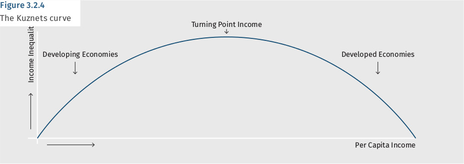
Both logics were used to pursue growth at any cost and not worry about social or environmental consequences that would somehow solve themselves in a future of prosperity. But both have been shown to be wrong.
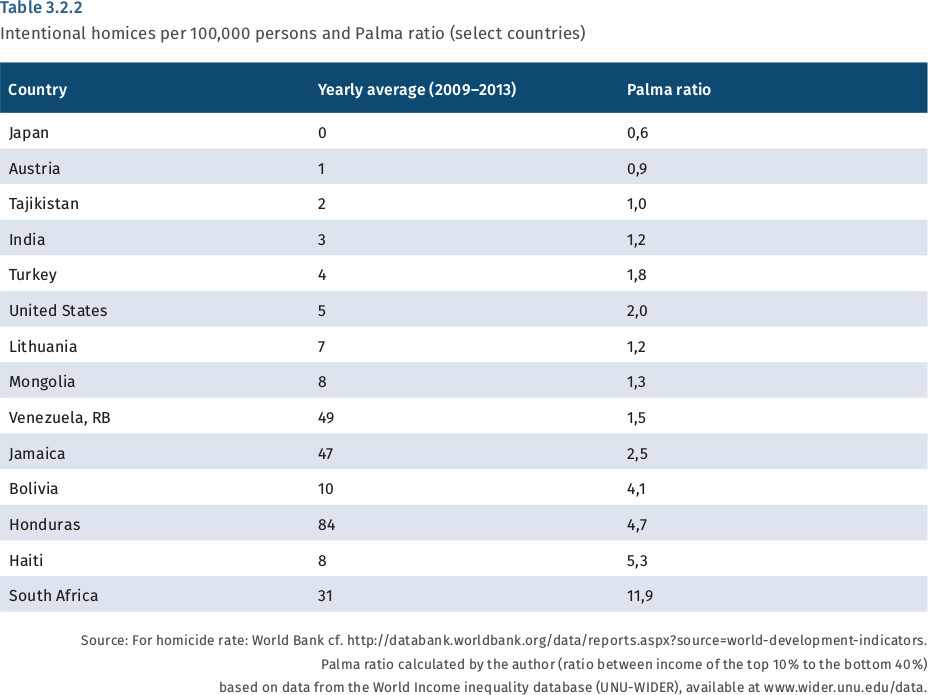
The Palma ratio - the income of the bottom 40 percent of the population in relation to the top 10 percent - is an intuitive and simple indicator. As the K curve predicts, the top positions are shared by Japan and Myanmar, one of the richest and one of the poorest countries in the world. But positions at the bottom of the table, where inequalities are extreme, are also shared by countries usually classified in very different development categories like Mexico, an OECD member, Brazil and South Africa, emerging economies, and Haiti, one of the least developed countries. China and Denmark both have a Palma ratio of 1, while the United States and Thailand have the same ratio of 2 and Chile, often considered as the most advanced economy in South America, and Paraguay, one of the poorest countries of the continent both have ratios of about 3.[fn]Cf. http://hdr.undp.org/en/composite/IHDI. [/fn]
The K curve is nowhere to be found in figure 3.2.5, which plots the Palma ratio against GDP per capita.
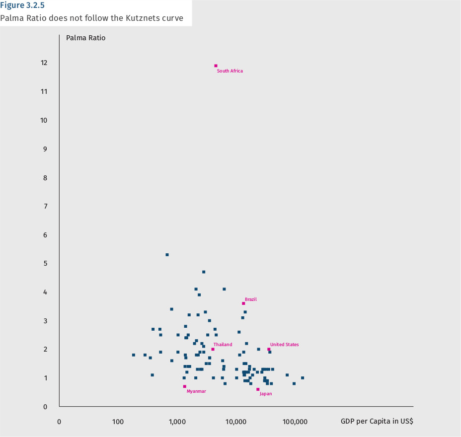
Income inequalities, or at least those qualified as “extreme” are now identified as an obstacle to economic recovery even by the IMF, and in SDG 10 of the 2030 Agenda governments committed to “reduce inequality within and among countries.” Yet, it is regrettable that even when well-established income inequality indicators (such as the Palma ratio and the Gini coefficient) exist, have a solid academic tradition and are regularly published by the World Bank and the United Nations University, they are not yet included among the list of official indicators for the SDGs.
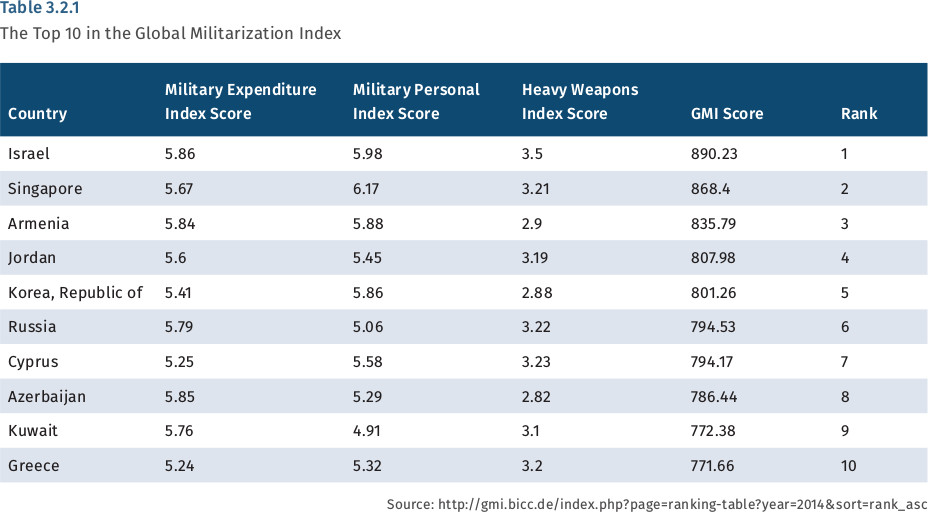
6. Global Militarisation Index
The Bonn International Center for Conversion compiles an annual Global Militarisation Index (GMI) that estimates the relative weight and importance of a country’s military apparatus in relation to its society as a whole.[fn]Cf. www.bicc.de/uploads/tx_bicctools/GMI_2015_EN_2015.pdf. [/fn] The 2015 GMI covers 152 states and bases its rankings on:
- the comparison of each country’s military expenditures with its GDP and its health expenditure (as share of GDP);
- the contrast between the total number of (para)military forces and the number of physicians in the overall population; and
- the ratio of the number of heavy weapons systems available and the number ofpeople in the overall population.
This index does not compare the absolute weight of military forces (or their global “footprints”) and therefore the United States and China are absent from the top ten, despite being global leaders in military spending. BICC explains that “this is because when their military expenditures are measured as a proportion of gross domestic product (GDP), and their military headcount and heavy weapon system numbers are measured per 1,000 inhabitants, the situation looks rather different.”[fn]Cf. www.bicc.de/publications/publicationpage/publication/global-militarisation-index-2015-627/. [/fn]
Among the ten countries with the highest level of militarization—namely Israel, Singapore, Armenia, Jordan, South Korea, Russia, Cyprus, Azerbaijan, Kuwait and Greece—three are in the Middle East, two in Asia and five in Europe.
Examining the relationships between militarization and the Human Development Index, the authors “find that a high GMI ranking is often accompanied by a high HDI value (Israel, Singapore)” but there also examples where a high GMI is combined with a low HDI, such as Chad, or Mauritania. Here, disproportionately high spending on the armed forces may be taking critical resources away from development.
The Institute for Economics and Peace publishes a yearly Global Peace Index (GPI)[fn]Cf. www.visionofhumanity.org/#/page/indexes/global-peace-index. [/fn] that ranks 163 countries based on 23 qualitative and quantitative indicators on three broad themes: the level of safety and security in society, the extent of domestic or international conflict and the degree of militarization. Most quantitative indicators are from reliable recognized international sources but the qualitative indicators rely on the Economist Intelligence Unit (a sister company to The Economist), whose reports include the Quality of Life Index (renamed the Where to be Born Index) among others, whose methodology to assess such things as political instability and obtain a number is not transparent.
The UN indicator framework currently incorporates as one of the indicators for Goal 16 the number of homicides per 100,000 inhabitants. These figures[fn]Cf. http://data.worldbank.org/indicator/VC.IHR.PSRC.P5. [/fn] exclude deaths as a result of battles or confrontation between organized armed groups, which are computed separatedly. The resulting table does not show a correlation with militarization or with the Human Development Index, as there are poor and rich countries among both the highest and lowest ends of the table, but there is a high correlation with inequalities.
7. Financial Secrecy Index
The Financial Secrecy Index[fn]Cf. http://www.financialsecrecyindex.com/. [/fn] computed by the Tax Justice Network (TJN) ranks jurisdictions according to their internal transparency and the scale of their offshore financial activities. It is a tool for monitoring and understanding global financial secrecy, tax havens or secrecy jurisdictions, and illicit financial flows or capital flight.
An estimated US$ 21 to US$ 32 trillion of private financial wealth is located, untaxed or lightly taxed, in “secrecy jurisdictions” around the world. Secrecy jurisdictions - a term used as an alternative to the more widely used term tax havens - attract illicit and illegitimate or abusive financial flows.
Illicit cross-border financial flows have been estimated at US$ 1-1.6 trillion per year: dwarfing the US$ 135 billion or so in global foreign aid. Since the 1970s African countries alone have lost over US$ 1 trillion in illicit financial outflows, while combined external debts are less than US$ 200 billion. So the African region is a major net creditor to the world - but its assets are in the hands of a wealthy elite, protected by offshore secrecy; while its debts are shouldered by broad sectors of the population in African countries.
European countries like Greece, Italy and Portugal have also been severly affected by decades of tax evasion and state looting via offshore secrecy.
According to TJN, “the offshore world corrupts and distorts markets and investments, shaping them in ways that have nothing to do with efficiency. The secrecy world creates a criminogenic hothouse for multiple evils including fraud, tax cheating, escape from financial regulations, embezzlement, insider dealing, bribery, money laundering, and plenty more. It provides multiple ways for insiders to extract wealth at the expense of societies, creating political impunity and undermining the healthy 'no taxation without representation' bargain that has underpinned the growth of accountable modern nation states.”[fn]Ibid. [/fn]
The FSI combines a qualitative measure and a quantitative one. The first looks at a jurisdiction’s laws and regulations, international treaties, and so on, to assess how secretive it is. It gets assigned a secrecy score: the higher the score, the more secretive the jurisdiction. The second measurement attaches a weighting to take account of the jurisdiction’s size and overall importance the global market for offshore financial services.
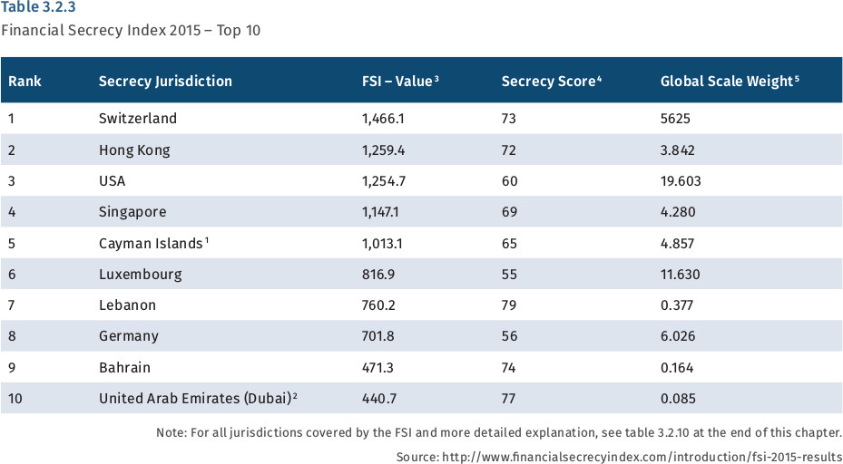
In identifying the most important providers of international financial secrecy, the Financial Secrecy Index reveals that “the world’s most important providers of financial secrecy are some of the world’s biggest and wealthiest countries. Rich OECD member countries and their satellites are the main recipients of or conduits for these illicit flows.”
8. “Social intensity of carbon”
“Carbon intensity” - defined as total emissions of CO2 in relation to GDP - is a key environmental indicator for the EPI and other assessments of environmental performance. China, which recently surpassed the USA as the world's largest emitter, claims in its climate action annual report released in November 2014, that its carbon intensity decreased 4.3 percent between 2012 and 2013 and dropped 28.6 percent from the 2005 level.
If economic output was stable, increased carbon intensity would mean reduced emissions. If an international agreement establishes carbon quotas, more intensity would allow for economic growth within the same emission total. But the world still has not allocated its “carbon budget,” that is, the emissions possible -or the reductions needed- to ensure that global warming does not surpasses two degrees Celsius (or, better, 1.5°C).
What causes climate change are absolute emissions, irrespective of their origin and it is therefore not very relevant to know that Benin is more carbon intensive than Russia, according to the Shift Project data portal.[fn] Cf. http://www.tsp-data-portal.org/TOP-20-Carbon-Intensity#tspQvChart. [/fn] The ethical highground of low intensity (high efficiency) is not obvious, as it would also require more information about who benefits from the resulting income growth, how it is distributed and what is its composition.
On the other hand, the “social intensity” of carbon emissions could provide a valuable indicator to assess sustainable development.
Figure 3.2.6 plots infant mortality on the vertical axis and per capita CO2 emissions from fossil fuels on the horizontal axis. El Salvador and Pakistan both emit roughly one tonne of carbon per capita a year, but the under five mortality rate of the latter is 85 per thousand and that of the former is 15 per thousand. Cuba’s infant mortality rate is lower than that of the United States with only one fifth of its per capita emissions.
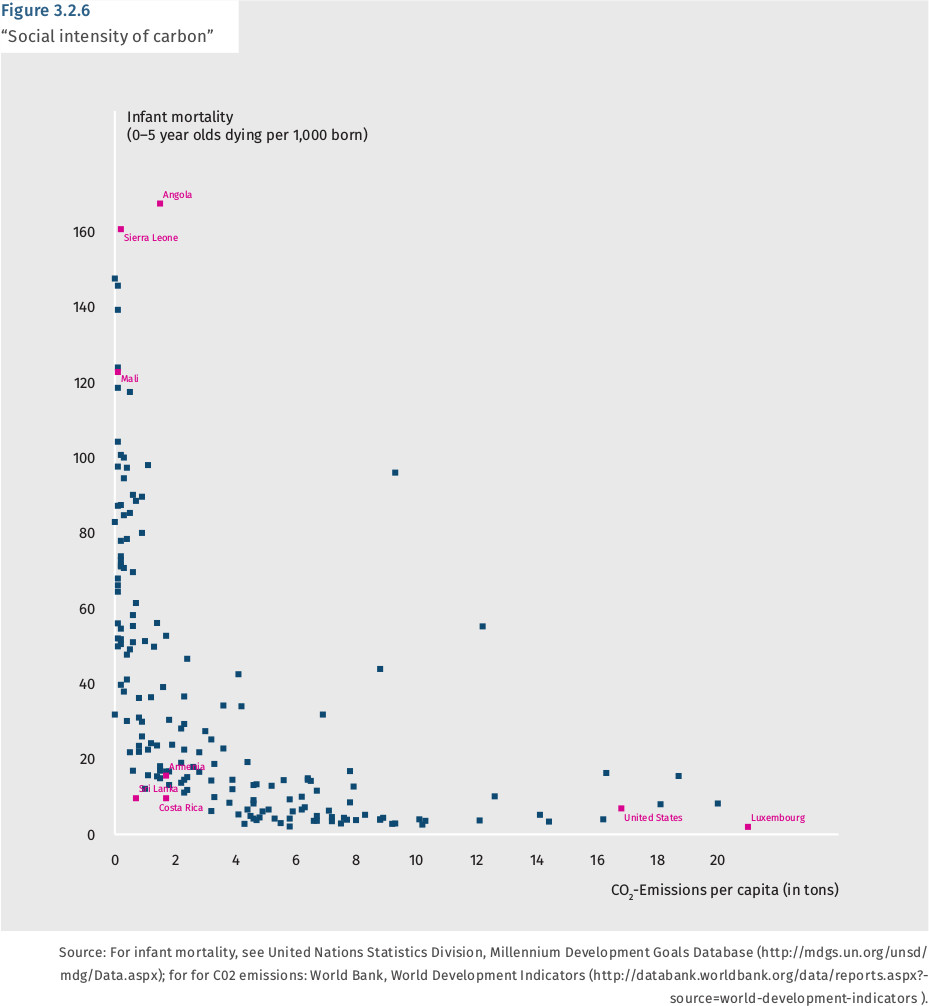
If high infant mortality and high carbon emissions per capita are regarded as equally undesirable, we can compute the distance to zero in the graph with a simple formula[fn]Distance to zero will be the root square of the sum of the squares of the x and y axis after converting their values into “distance” for example by attributing a value of 100 to the more distant point in each axis. [/fn] that will provide the ranking in table 3.2.11 below.
At the top of the table, Sri Lanka comes first with the same infant mortality rate as the United States, but less than a tonne of carbon emissions per capita a year. Costa Rica, with the same mortality rate emits a bit more and comes third while Luxembourg and Angola share similar positions at the bottom of the table, the latter for its unusual high infant mortality rate and the former, with one of the lowest infant mortality rates in the world has an unusually high level of carbon emissions per capita. (Small oil producing countries like Qatar and Kuwait are excluded from the table because of data comparability issues.)
This table does not correlate with HDI or per capita income and its inclusion in the dashboard can therefore help throw new light on the debate around what “universality” in the 2030 Agenda means and why no country can claim to be sustainably developed.
What needs to be done
The proposed eight figures in the dashboard cover environmental, social and economic topics, in line with the three dimensions of sustainable development. But more work needs to be done on such issues as environmental footprints and extraterritorial impacts of national policies, from damaging subsidies (in agriculture, fisheries or fossil fuels) to the “races to the bottom” in taxation, deregulation of big corporations or competitive devaluations, all of which create net global damage in pursuit of small short term national advantages.
Future editions of the Spotlight Report will throw more light on these issues.
The tabular annex to this chapter is available here.
Bierbaum, Mira/Oppel, Annalena/Tromp, Sander/Cichon, Michael (2016): A Social Protection Floor Index: Monitoring National Social Protection Policy Implementation. Discussion Paper of the Maastricht Graduate School of Governance/UNU-MERIT. Berlin: Friedrich-Ebert-Stiftung.
http://library.fes.de/pdf-files/iez/12490.pdf
Climate Equity Reference Project (2015): Fair Shares: A Civil Socitey Equity Review of INDCs. Berkeley, CA/Stockholm.
http://civilsocietyreview.org/report
Commission on the Measurement of Economic Performance and Social Progress (2009): Report by the Commission on the Measurement of Economic Performance and Social Progress. Paris.
www.insee.fr/fr/publications-et-services/default.asp?page=dossiers_web/stiglitz/documents-commission.htm
Hsu, Angel et al. (2016): 2016 Environmental Performance Index. New Haven, CT: Yale University.
www.epi.yale.ed
Sachs, Jeffrey D./Schmidt-Traub, Guido/Durand-Delacre, David (2016): Preliminary Sustainable Development Goal (SDG) Index and Dashboard. SDSN Working Paper, 15 February 2016. New York.
http://unsdsn.org/resources/publications/sdg-index/
United Nations (2015): Transforming our world: the 2030 Agenda for Sustainable Development. New York (UN Doc. A/RES/70/1).